This post is for users of the Voxel framework. Check them out: www.getvoxel.io
Just remember that as Voxel adds more features, you may not need this. In the meantime, let’s have fun making the internet a little more beautiful.
Note: This custom CSS is to be used with the Voxel Post Feed Widget (27 Post Feed). As usual, I recommend adding the code to your Voxel Child Theme. Get the child theme here.
Step One:
I know at the moment it’s tricky to use a Voxel dynamic image as a background. So the container that contains the post title, category, etc. has to be set as Absolute in the Advanced settings. If the container is not visible after setting it to Absolute, you will have to set the z-index to higher than the image container. Or you can just download the preview card template I provided.
Step Two:
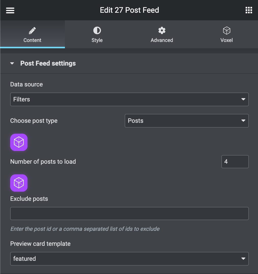
- Add the Voxel Post Feed widget (27 Post Feed) to the area you want to display it.
- Set the Data source to “Filters”.
- Choose whichever post type you like.
- Set the number of posts to load to “4”.
- Set the Preview card template to the preview card I provided, or you created.
Step Three:
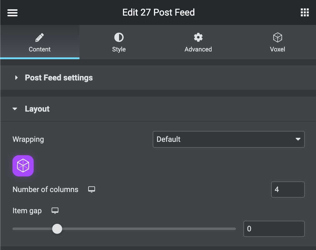
- Under the Layout section, set the number of columns to “4”.
- Set the item gap to “0”. (The grid-gap will be added in the CSS code.)
Step Four:
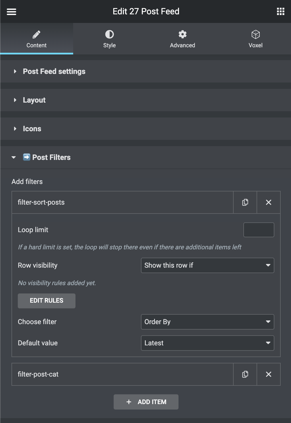
- Under the Post Filters section, Add a filter for “Order By”, and set it to “Latest”.
- I added another filter and set the “Post Category” to “featured” (which is a category I created). So I could set which posts I want to be on the top featured post area. Of course, you would have to add the “featured” category to the posts you want to display here.
Step Five:
Add the custom CSS Class “custom-grid” to the Post Feed widget under the advanced tab.

Step Six:
Add the following code to your Child Theme.
					/* ***** Code for 27 Post Feed */
.custom-grid .post-feed-grid {
  --cust-grid-gap: 4px;
  --cust-post-feed-height: 400px;
}

.custom-grid .post-feed-grid {
  grid-gap: var(--cust-grid-gap) !important;
  grid-template-areas:
    "post1 post2 post2"
    "post1 post3 post4" !important;
  grid-template-columns: 55% 1fr 1fr !important;
  grid-template-rows: 5fr 5fr !important;
}

.custom-grid .post-feed-grid > div:nth-child(1) {
  grid-area: post1;
}
.custom-grid .post-feed-grid > div:nth-child(2) {
  grid-area: post2;
}
.custom-grid .post-feed-grid > div:nth-child(3) {
  grid-area: post3;
}
.custom-grid .post-feed-grid > div:nth-child(4) {
  grid-area: post4;
}

.custom-grid .post-feed-grid > div:nth-child(1) img {
  height: calc(var(--cust-post-feed-height) + var(--cust-grid-gap));
}
.custom-grid .post-feed-grid > div:nth-child(2) img,
.custom-grid .post-feed-grid > div:nth-child(3) img,
.custom-grid .post-feed-grid > div:nth-child(4) img
{
  height: calc(var(--cust-post-feed-height) / 2);
}


@media (max-width: 940px) {
  .custom-grid .post-feed-grid {
    grid-template-areas:
      "post1 post1"
      "post2 post2"
      "post3 post4" !important;
      grid-template-columns: 1fr 1fr !important;
  }
  .custom-grid .post-feed-grid > div img {
    height: calc(100vh / 5 ) !important;
  }
}
Below is the minified version
.custom-grid .post-feed-grid{--cust-grid-gap:4px;--cust-post-feed-height:400px;grid-gap:var(--cust-grid-gap)!important;grid-template-areas:"post1 post2 post2" "post1 post3 post4"!important;grid-template-columns:55% 1fr 1fr!important;grid-template-rows:5fr 5fr!important}.custom-grid .post-feed-grid>div:first-child{grid-area:post1}.custom-grid .post-feed-grid>div:nth-child(2){grid-area:post2}.custom-grid .post-feed-grid>div:nth-child(3){grid-area:post3}.custom-grid .post-feed-grid>div:nth-child(4){grid-area:post4}.custom-grid .post-feed-grid>div:first-child img{height:calc(var(--cust-post-feed-height) + var(--cust-grid-gap))}.custom-grid .post-feed-grid>div:nth-child(2) img,.custom-grid .post-feed-grid>div:nth-child(3) img,.custom-grid .post-feed-grid>div:nth-child(4) img{height:calc(var(--cust-post-feed-height)/ 2)}@media (max-width:940px){.custom-grid .post-feed-grid{grid-template-areas:"post1 post1" "post2 post2" "post3 post4"!important;grid-template-columns:1fr 1fr!important}.custom-grid .post-feed-grid>div img{height:calc(100vh / 5)!important}}


